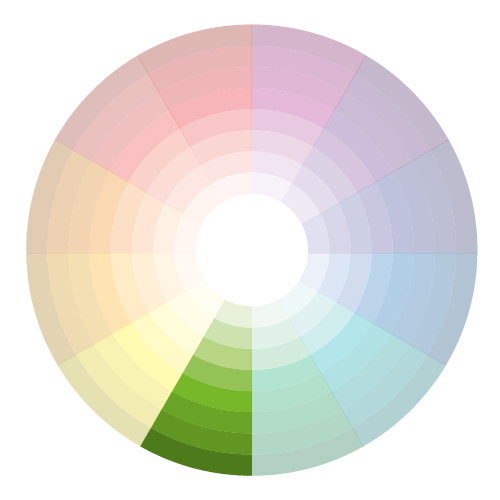
We all know that color is important, because it can deliver more influencing experience to the viewer. what colors do we choose? How do we make numerous colors work together? In this post, we’ll look at a few color schemes used by most of designers that will help us to decide which colors to use for our specific project.
Let’s first understand how the varieties of all colors are formed. All the colors can be received from the combination of primary colors, which are red, yellow and blue. These colors different from the others by the fact that they cannot be created by mixing the other colors.
In order to make secondary colors you should mix the primary ones. By mixing red with yellow we get orange, and by mixing red with blue you get a violet color. Blue together with yellow turns into green.

The Color Wheel
The color wheel or color circle is the basic tool for combining colors. The first circular color diagram was designed by Sir Isaac Newton in 1666.
The color wheel is designed so that virtually any colors you pick from it will look good together. Over the years, many variations of the basic design have been made, but the most common version is a wheel of 12 colors based on the RYB (or artistic) color model.
Traditionally, there are a number of color combinations that are considered especially pleasing. These are called color harmonies or color chords and they consist of two or more colors with a fixed relation in the color wheel.
ColorImpact is designed to dynamically create a color wheel to match your base color.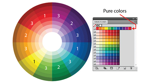
Red: Passion, Love, Anger
Orange: Energy, Happiness, Vitality
Yellow: Happiness, Hope, Deceit
Green: New Beginnings, Abundance, Nature
Blue: Calm, Responsible, Sadness
Purple: Romance, Royalty, Wealth
Black: Mystery, Elegance, Evil
Gray: Moody, Conservative, Formality
White: Purity, Cleanliness, Virtue
Brown: Nature, Wholesomeness, Dependability
Tan or Beige: Conservative, Piety, Dull
Cream or Ivory: Calm, Elegant, Purity
Complementary
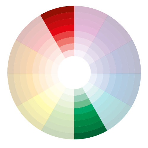
Complementary colour schemes are built from colours directly across each other on the colour wheel. This scheme needs to be used with much more caution, because when complimentary colours are placed next to each other they appear brighter, or more intense, than they do next to any other colour.(for example red and green).

Split Complementary
This scheme is the variation of complementary color scheme. It uses a color and two colors adjacent to the complement for a total of three colours. . Only right or left colors from a complementary color are used.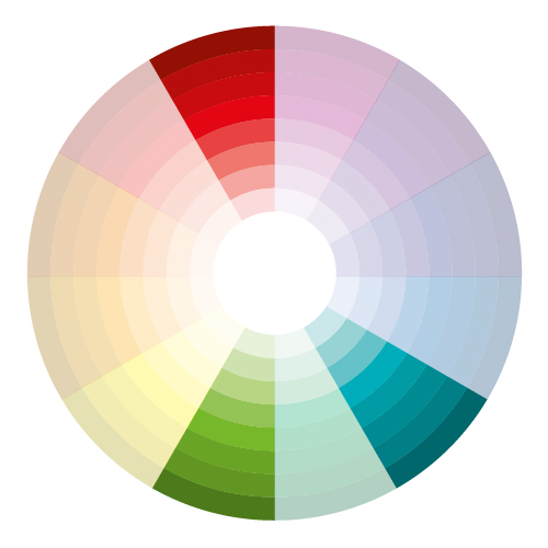

Triadic
Triadic colour schemes use three equally-spaced colours around the colour circle. This scheme gives a strong visual contrast with harmony and color richness.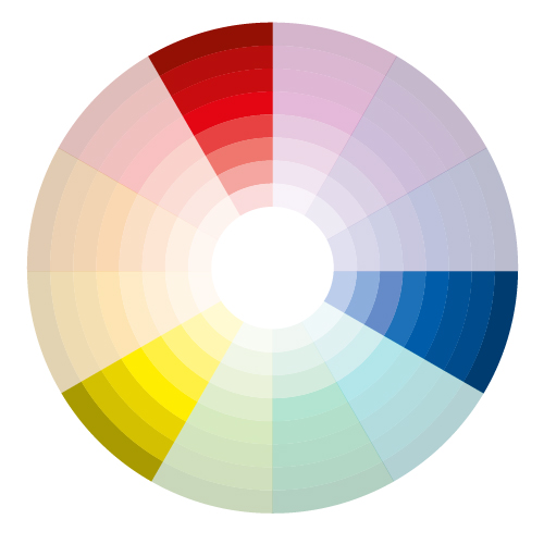

Tetradic (Double Complementary)
The tetrad is simply a combination of two complementary colours that are at right angles to each other.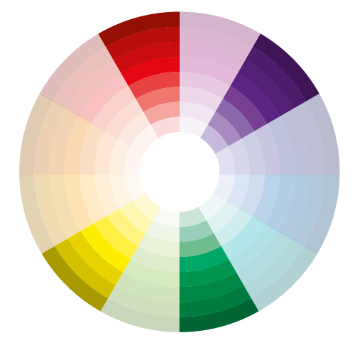

Analogous
In this scheme we use colors that are placed near each other in the color spectrum. This kind of scheme is often used for the creation of peaceful and comfortable designs.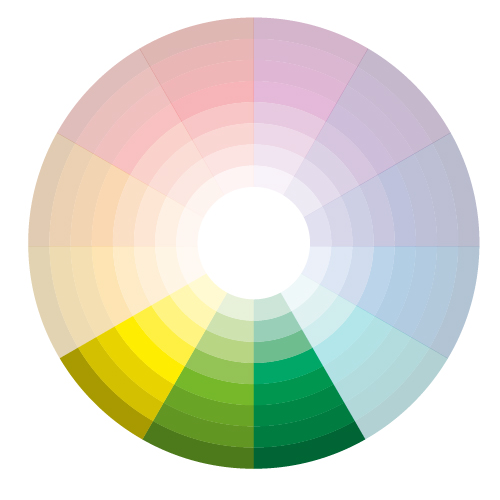

Monochromatic
The variations of brightness and intensity of one color is used in this scheme. This scheme is simple and elegant, colors are soothing. The basic colors can be combined with neutral ones such as white, black and gray to contrast the elements of a composition.